Cru Communications — Branding
Following on from the branding for 'Un~Corked Communications', Colleen has formed a partnership with a fellow food PR business and needed new branding for this new entity.
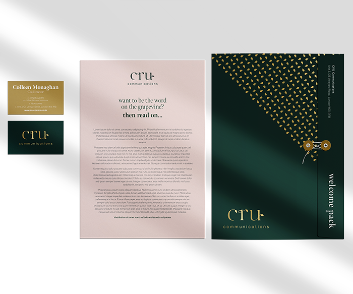
Similar to the previous brief, there was clear direction built around the word 'Cru' which led itself to a simple, elegant brand. Built around the concept of a 'grapevine', and how this applies to food PR. Leaves feature on the wordmark, alone with visual furniture and pattern work.
—
Ready to see how I can help you? Want to discuss your latest project? Simply want to meet for a coffee and geek out? You merely need to ask…


