Hotcakes — Branding.
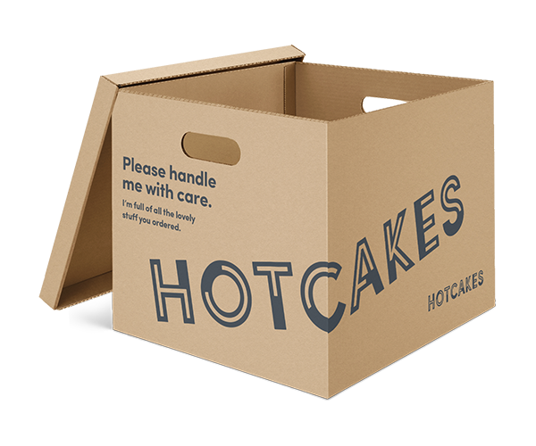
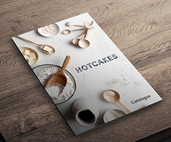
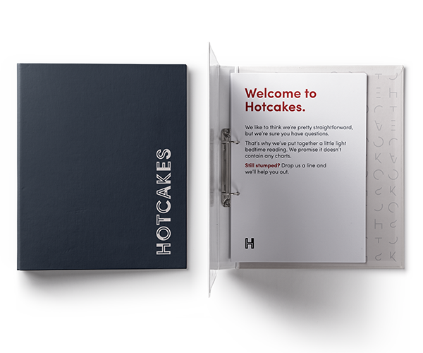
Tara approached me needing a brand for her new B2B Food retailer. Tara wanted a simple logo at the centre of it, as part of a clean aesthetic which would run throughout the brand.
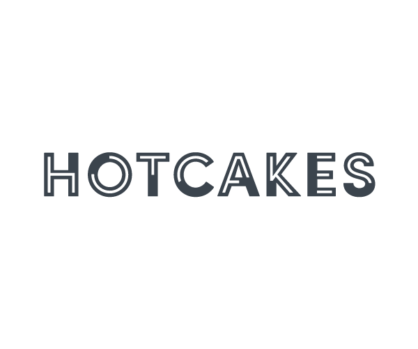
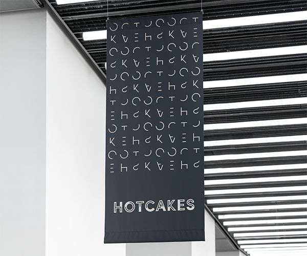
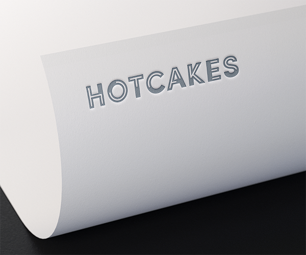
The brand features a simple, bold logotype with characterful inline cuts that specifically manage to create the name in it's most minimum form. This 'minimalist' type can then be used for pattern creation across the branding.
—
Ready to see how I can help you? Want to discuss your latest project? Simply want to meet for a coffee and geek out? You merely need to ask…